[feat-img-left]
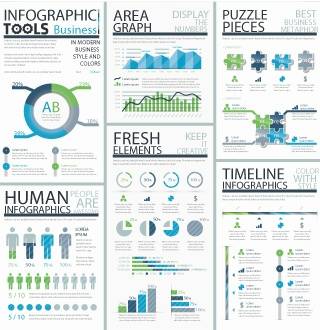
Infographics have been growing in popularity recently and it’s almost impossible to go a day without seeing a new one. As learning professionals, we’re aware of the effectiveness that visuals add to learning design, but how about including infographics in our designs as a compelling way to convey data and otherwise dry information?
Visuals are more likely to be shared with others over text-only content, so infographics are a useful way to promote social learning on a topic. And according to Visual.ly, infographics are also helpful for simplifying complex topics and increasing learning retention.
Infographics can be designed to display a whole gamut of information. Consider these diverse examples:
Each infographic succinctly gets the information across quickly in one clean graphic. Most infographics are designed in sans serif font and have an average of 2.29 sources listed, according to this
infographic about infographics by Ivan Cash.
And if you want to learn more foundational information about this subject, look no further than the king of visual information,
Edward Tufte, author of
The Visual Display of Quantitative Information. If you ever get a chance to attend one of his workshops, by all means do it.
You can hire a graphic designer who specializes in infographics or there are a number of online tools available to help you create your own.
Easel.ly – Easel.ly helps you create simple infographics, or as the Easel.ly refers to them, “vhemes,” for visual themes. The interface is very user-friendly and there are a lot of graphical elements available. This tool is still in beta and is not supported on the Internet Explorer browser.
Infogr.am – Sign up for a free account and you can create infographics with charts (bar, pie, matrix or line), quotes, maps, graphics and text.
Piktochart – Piktochart has five themes available for a free account, and if you opt to upgrade to pro, there are monthly and annual pricing options and a wide variety of themes to use.
Sutori – Use Sutori when you need to create a timeline, for example to display your organization’s history in new hire training.
Gliffy –Gliffy has a number of specific uses, including designing flow charts, Venn diagrams and wireframes.
And if you’re looking for design inspiration, here are some websites that deliver:


