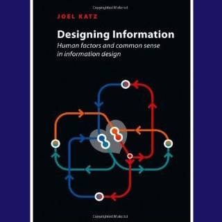
[feat-img-left] Edward Tufte fans and design lovers, listen up. You’re going to want to add Joel Katz’s new book, Designing Information: Human Factors and Common Sense in Information Design, to your wish list. Katz, an information designer who teaches at The University of the Arts and Philadelphia University, has assembled a visual feast of information design do’s and don’ts that are useful for those of us who communicate for a living. Katz explains that an information designer’s role is “to clarify, to simplify, and to make information accessible to the people who will need it and use it to make important decisions.” It could be a safety poster, assembly instructions or a directional sign. The information conveyed needs to be in a form that the user can understand and use meaningfully. It’s important to have clear information design now more than at any other time in history, given the unprecedented increase in accessible data. Cartographers, whom Katz calls the original information designers, used to draw sea dragons or wrote, “There be lions,” on maps in the areas where they lacked data on what actually existed. “Our challenge today is almost the opposite from that of centuries, or even decades, past: to invent ways of sifting through multitudes of data that bombard us daily, often numbing our senses and scrambling our brains,” says Katz. Some of the more salient examples in the book include the unsuccessful attempts by the U.S. Department of Agriculture to revamp the food pyramid that was originally developed in 1992 and criticized for being ineffective. The pyramid diagram was revised in 2005, and recreated in the shape of a food plate in 2011 for the sum of $2 million. Katz explains that using the same shapes (such as circles) to make quantitative comparisons is ineffective because variances in degree are better represented by differences in color and size. There are examples of his students’ attempts to illustrate nutritional information that are a better representation of the data. Information design needs to be pragmatic, and relatable to the user. Katz compares and contrasts two examples of accessible symbolism in American monument design, for example: the 168 empty chairs in the Oklahoma City bombing memorial is a successful implementation of symbolism whereas the 1,776-foot height of the Freedom Tower fails at delivering its message. Understanding audience needs is paramount to good information design. Katz says that understanding the needs of the user and the context in which the design is used will “foster a deeper understanding of design function and empathy with the user.” For example, when speaking with a PowerPoint slide show, Katz advises using as few words as possible because one of the more challenging aspects of multitasking for audience members is listening to a lecture and reading text at the same time. With the use of metaphor and simile, Katz quotes Richard Saul Wurman (who coined the term, information architecture) who says, “People only understand something relative to something they already understand.” Katz suggests using more relatable analogies such as the inner-workings of the human body as illustrated with battles in space or with common kitchen utensils. It may sound implausible, but the illustrations work. It’s a good point to keep in mind when introducing new concepts. All in all, the book is an inspiring compendium of how to convey information in pragmatic and meaningful ways and is a good resource to add to your reference library.


